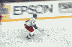
i like the grey ones but BRING BACK THE PINK ONES wow that was kewl the pink and the black just like bret hart bring them back

 Sniper
i like the grey ones but BRING BACK THE PINK ONES wow that was kewl the pink and the black just like bret hart bring them back
Power Forward
Bret "The Hitman" Hart did help design those grey/pink jerseys.
They were original!
And from a fan's point of view, I sure would like to be able to purchase them NEW once more (not used/ebay/etc.), and personalizing them using the 'gothic-style' of letter.
4th Liner
werent they just a 10 year thing?
Power Forward
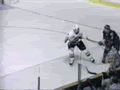
The Hitmen had a '10th Anniversay Jersey' (which was grey), which is different from their original 'grey/pink' jerseys.
The image of the 'anniversary' jersey.
Ok, not the original (temporary replacement logo), but the jersey colors are correct.
The original logo was deemed offensive to some people, because of the angle of the hockey stick.
The angle of the hockey stick? Wow ... I would have thought most of the team would have objected to wearing pink!!! :skeptical
BANNED
For some reason I seem to recall the logo having flames in the man's eyes which some thought was too scary for children.Then they changed it.I don't recall it being the stick that was the problem.Originally Posted by The_Vulk
Oh, that makes sense cause looking at the current logo, the stick is in the same place
Power Forward
Yes, it was the stick.
From the angle of the stick, and how high it was, it was thought that the person was in the process of hacking down on someone, or that it would be a high sticking.
Either way, if was TOO violent for certain people back then (including the Flames, would operated the Saddledome, whom told the Hitmen to change it).
Funny, that since the Flames now own the Hitmen, that issue is no longer a concern to them.
That, and the backlash FANS had over the change.
 Posting Permissions

 Reply With Quote